> For the complete documentation index, see [llms.txt](https://docs.flatredball.com/gum/llms.txt). Markdown versions of documentation pages are available by appending `.md` to page URLs; this page is available as [Markdown](https://docs.flatredball.com/gum/code/controls/checkbox.md).
# CheckBox
## Introduction
The CheckBox control provides the ability to display a true/false state and allows the user to toggle the state through clicking.
## Code Example: Adding a CheckBox
```csharp
// Initialize
var checkBox = new CheckBox();
checkBox.AddToRoot();
checkBox.X = 50;
checkBox.Y = 50;
checkBox.Text = "Checkbox";
checkBox.Checked += (_,_) => checkBox.Text = $"IsChecked:{checkBox.IsChecked}";
checkBox.Unchecked += (_, _) => checkBox.Text = $"IsChecked:{checkBox.IsChecked}";
```
[Try on XnaFiddle.NET](https://xnafiddle.net/#snippet=H4sIAAAAAAAAA6tW8ix2L81VsiopKk3VUcrMyyzJTMzJrEpVslIqSyxSSM5ITc52yq9QsFXISy1XcIZyNTStY_JgcnqOKSkh-UH5-SWowhFATaYGyCKRGCIhqRUlQMGYUgMDIyOw6Un5FRAesjKwTGoKRJ2TrYJGvE68poItiGvsqoBumgrEAM9iqDarargKuFgtpiWhECaqNQpUskepFgDci7UfawEAAA)
CheckBox responding to Checked and Unchecked events by printing output
## IsChecked
IsChecked is a nullable bool value.
| Value | Details |
| ------- | ------------------------------------- |
| `true` | CheckBox is checked |
| `false` | CheckBox is not checked |
| `null` | CheckBox is in an indeterminate state |
The following code creates three checkboxes each set to one of the three `IsChecked` values:
```csharp
// Initialize
var stackPanel = new StackPanel();
stackPanel.AddToRoot();
var checkBox = new CheckBox();
stackPanel.AddChild(checkBox);
checkBox.IsChecked = true;
var checkBox2 = new CheckBox();
stackPanel.AddChild(checkBox2);
checkBox2.IsChecked = false;
var checkBox3 = new CheckBox();
stackPanel.AddChild(checkBox3);
checkBox3.IsChecked = null;
```
[Try on XnaFiddle.NET](https://xnafiddle.net/#snippet=H4sIAAAAAAAAA6tW8ix2L81VsiopKk3VUcrMyyzJTMzJrEpVslIqSyxSKC5JTM4OSMxLzVGwVchLLVcIhgtoaFrH5CHk9RxTUkLyg_LzS8ASIM3JGanJ2U75FVCtzlAuFo3OGZk5KRow9SB5GFvPsxisLzUFaArIkWhmG5FquBGy6UYoxqcl5hSjm29MqvnGyOYbo5ifV5qTY61UCwD-QP0DdAEAAA)
### Three State CheckBox (IsThreeState)
By default, a CheckBox only cycles between `Checked` and `Unchecked` when clicked. Setting `IsThreeState` to `true` allows the user to cycle through all three states by clicking.
When `IsThreeState` is true, clicking the CheckBox follows this cycle: **Unchecked -> Checked -> Indeterminate -> Unchecked**
The following code creates a CheckBox that supports three states:
```csharp
// Initialize
var checkBox = new CheckBox();
checkBox.AddToRoot();
checkBox.Text = "Three State CheckBox";
checkBox.IsThreeState = true;
```
[Try on XnaFiddle.NET](https://xnafiddle.net/#snippet=H4sIAAAAAAAACqtW8ix2L81VsiopKk3VUcrMyyzJTMzJrEpVslIqSyxSSM5ITc52yq9QsFXISy1XcIZyNTStY_JgcnqOKSkh-UH5-SWowiGpFSVAfTFKIRlFqakKwSWJJalwE2KUkJV6FoPVQJTYKoAcY61UCwA0LOBQnQAAAA)
## CheckBox Width and Height
Default CheckBoxes have the following default values:
Variable
Value
Width
128
WidthUnits
Absolute
Height
32
HeightUnits
Absolute
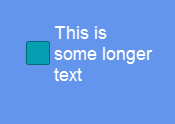
The text within the CheckBox draws and wraps according to the bounds of the CheckBox. In other words, longer text results in line wrapping, as show in the following code block:
```csharp
// Initialize
var checkBox = new CheckBox();
checkBox.Y = 24;
checkBox.Text = "This is some longer text";
checkBox.AddToRoot();
```
[Try on XnaFiddle.NET](https://xnafiddle.net/#snippet=H4sIAAAAAAAAA6tW8ix2L81VsiopKk3VUcrMyyzJTMzJrEpVslIqSyxSSM5ITc52yq9QsFXISy1XcIZyNTStY_JgcnqRQFkjE2SRkNSKEqBgTKmBgZFRSEZmsQIQFefnpirk5OelpxYplAAVQGSRtTmmpITkB-XnlwDNV6oFAAAIwCycAAAA)
ComboBox with wrapped text
---
# Agent Instructions
This documentation is published with GitBook. GitBook is the documentation platform designed so that both humans and AI agents can read, navigate, and reason over technical content effectively. Learn more at gitbook.com.
## Querying This Documentation
If you need additional information that is not directly available in this page, you can query the documentation by asking a question.
Perform an HTTP GET request on the following URL with the `ask` and `goal` query parameters:
```
GET https://docs.flatredball.com/gum/code/controls/checkbox.md?ask=&goal=
```
`ask` is the immediate question: it should be specific, self-contained, and written in natural language.
`goal` is what the user is ultimately trying to achieve, the reason they need the answer. Sharing it helps GitBook give you a better, more relevant answer. A goal is most helpful when it describes the outcome the user wants rather than restating the question. For example, with `ask=how do I create an API token`, a goal like `automate deployments from our CI pipeline` lets GitBook tailor the answer to that use case.
The response will contain a direct answer to the question and relevant excerpts and sources from the documentation.
Use this mechanism when the answer is not explicitly present in the current page, you need clarification or additional context, or you want to retrieve related documentation sections.