> For the complete documentation index, see [llms.txt](https://docs.flatredball.com/gum/llms.txt). Markdown versions of documentation pages are available by appending `.md` to page URLs; this page is available as [Markdown](https://docs.flatredball.com/gum/code/controls/itemscontrol.md).
# ItemsControl
## Introduction
`ItemsControl` provides a way to display a collection of controls. By default all contained controls are stacked and allow scrolling with a ScrollBar.
{% hint style="info" %}
ItemsControl is similar to ListBox, but it is more general since it does not support selection. When items are added to the Items property the ItemsControl does not create a control which inherits from ListBoxItem. Similarly, its VisualTemplate does not need to be a type which supports a ListBoxItem.
{% endhint %}
ItemsControl inherits from ScrollViewer, so it supports the same scrolling behavior, including the `MouseWheelScrollSpeed` property for tuning mouse-wheel scroll speed. For more information about inherited properties, see the [ScrollViewer](/gum/code/controls/scrollviewer.md) page.
## Code Example: Adding to Items Property
If an object is added to the `Items` property then the `ItemsControl` creates a view to represent this. By default this is a `Label` instance, but it can be customized through the `VisualTemplate` property.
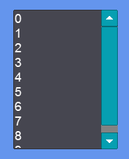
The following code creates ten `Labels` by adding integers to the `Items` property.
```csharp
// Initialize
var itemsControl = new ItemsControl();
itemsControl.AddToRoot();
for(int i = 0; i < 10; i++)
{
itemsControl.Items.Add(i);
}
```
[Try on XnaFiddle.NET](https://xnafiddle.net/#snippet=H4sIAAAAAAAACqvm5VJQUPIsdi_NVbJSKCkqTdUBi2TmZZZkJuZkVqUChZXKEosUMktSc4ud8_NKivJzFGwV8lLLFTyRhDQ0rWOAehACeo4pKSH5Qfn5JWCptPwijcy8EoVMoF4DayBlo2AIorW1NWPyqmPyFIAARTvYcJAhGpkg_bVKvFy1vFwA64IJNbAAAAA)
ItemsControl with ten items
## Code Example: Fixed-Size Scrollable List
Setting explicit `Width` and `Height` values gives the ItemsControl a fixed size so that its content scrolls when it overflows. This is useful for displaying a non-selectable scrollable list in a fixed area.
```csharp
// Initialize
var itemsControl = new ItemsControl();
itemsControl.AddToRoot();
itemsControl.Width = 200;
itemsControl.Height = 150;
for(int i = 0; i < 20; i++)
{
itemsControl.Items.Add("Item " + i);
}
```
[Try on XnaFiddle.NET](https://xnafiddle.net/#snippet=H4sIAAAAAAAACmWOPwvCMBDF90K_w5EppSJRcLE6iIN2FcElSyHRHrQJpFcFS7-7ly7-u-Udv8e7e0OaAIiyO_StWAOF3s4mgg4JqwaflrG4VwGQbNvtvaPgG9iCsw8oP5DMCs2ZN5jvjDn7k_f0b13QUM1Hlkr9WkeLt5rYW6yid_VBoiNAJqpg2XCINc8z7QbtgOcrP3WKv6UWcQctIAeMFUaRJuML5gZQPvEAAAA)
## Decorations
`ItemsControl` supports inert *decorations* — separators, headers, and other chrome that render between rows without becoming items. Add them with `AddDecoration`, `InsertDecorationAfter`, and `InsertDecorationBefore`. Because these methods are defined on `ItemsControl`, they are also available on `ListBox`, where the behavior is documented in full — see [Decorations and Separators](/gum/code/controls/listbox.md#decorations-and-separators) on the ListBox page.
---
# Agent Instructions
This documentation is published with GitBook. GitBook is the documentation platform designed so that both humans and AI agents can read, navigate, and reason over technical content effectively. Learn more at gitbook.com.
## Querying This Documentation
If you need additional information that is not directly available in this page, you can query the documentation by asking a question.
Perform an HTTP GET request on the following URL with the `ask` and `goal` query parameters:
```
GET https://docs.flatredball.com/gum/code/controls/itemscontrol.md?ask=&goal=
```
`ask` is the immediate question: it should be specific, self-contained, and written in natural language.
`goal` is what the user is ultimately trying to achieve, the reason they need the answer. Sharing it helps GitBook give you a better, more relevant answer. A goal is most helpful when it describes the outcome the user wants rather than restating the question. For example, with `ask=how do I create an API token`, a goal like `automate deployments from our CI pipeline` lets GitBook tailor the answer to that use case.
The response will contain a direct answer to the question and relevant excerpts and sources from the documentation.
Use this mechanism when the answer is not explicitly present in the current page, you need clarification or additional context, or you want to retrieve related documentation sections.