> For the complete documentation index, see [llms.txt](https://docs.flatredball.com/gum/llms.txt). Markdown versions of documentation pages are available by appending `.md` to page URLs; this page is available as [Markdown](https://docs.flatredball.com/gum/code/controls/listbox.md).
# ListBox
## Introduction
The ListBox control provides a scrollable list of ListBoxItems for displaying and selecting from a list.
ListBox inherits from ScrollViewer, so it supports the same scrolling behavior. This includes the `MouseWheelScrollSpeed` property, which controls how far the list scrolls per mouse-wheel notch. For details see [Mouse Wheel Scroll Speed](/gum/code/controls/scrollviewer.md#mouse-wheel-scroll-speed) on the ScrollViewer page.
## Code Example: Adding a ListBox
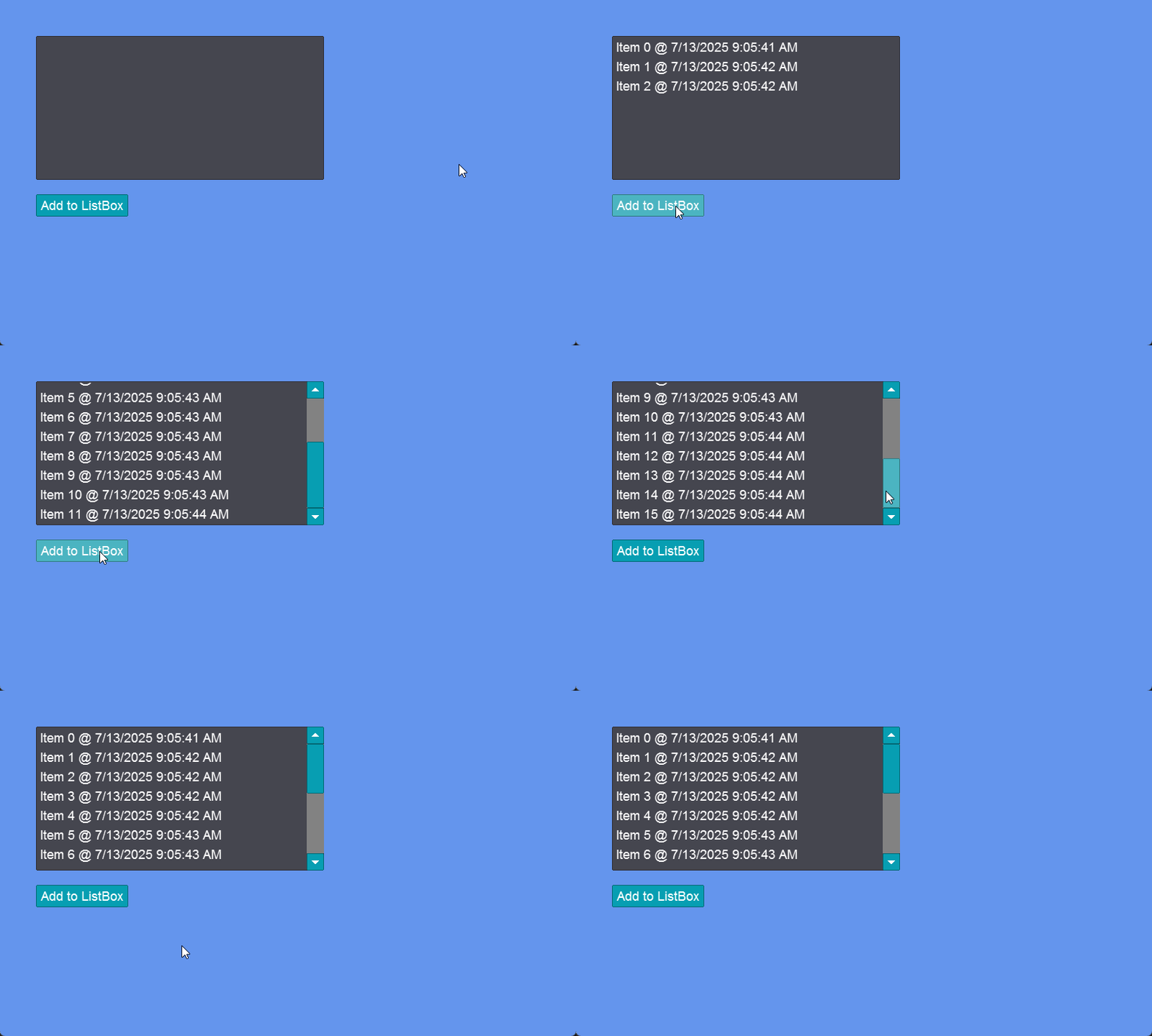
The following code adds items to a ListBox when a button is clicked. When an item is added, `ScrollIntoView` is called so the item is shown.
```csharp
// Initialize
var listBox = new ListBox();
listBox.AddToRoot();
listBox.X = 50;
listBox.Y = 50;
listBox.Width = 400;
listBox.Height = 200;
var button = new Button();
button.AddToRoot();
button.X = 50;
button.Y = 270;
button.Text = "Add to ListBox";
button.Click += (s, e) =>
{
var newItem = $"Item {listBox.Items.Count} @ {DateTime.Now}";
listBox.Items.Add(newItem);
listBox.ScrollIntoView(newItem);
};
```
[Try on XnaFiddle.NET](https://xnafiddle.net/#snippet=H4sIAAAAAAAACl2PX0vDMBTF3wv9DpfgQ4ejjKEIjopughbEBy3-gbzUNbiLaQLtrR2WfneTLNNsecr55eSec4c4AmB5e9fV7BKo6cTUEVRIWEr8EQaz77IBiS0t9RYyUKKHh51KJguu_Et6U1WFftKaDuib-XE-C8D7MXjFijYGns1Cei_wc0MGzx3mypb46Ii08h2WTriwHT9q4OFfAa9t_vwiAIXY2hzOzHcgvd-Ns3_LSuL6C04zSNopiAlkV1wNXIE5tpZpk5OozZATztxt2K9hVZuudKdohGsYbksSBdYifdT96CLskEO36ZH4kXaP0PC8brSUuSL9gqIPXeOCxdEYR78IY1Gh0gEAAA)
Adding items to a ListBox by clicking a button
## Items
The Items property contains the data that is displayed by the ListBox. Whenever an object is added to Items, the ListBox creates a ListBoxItem instance.
Any object can be added to Items. By default, `ToList` is called on any added item. The following code shows how `int` and `string` instances can be added and mixed in a ListBox:
```csharp
// Initialize
StackPanel stackPanel = new();
stackPanel.AddToRoot();
stackPanel.Anchor(Gum.Wireframe.Anchor.Center);
ListBox listBox = new();
stackPanel.AddChild(listBox);
Button addIntButton = new();
addIntButton.Text = "Add Integer";
stackPanel.AddChild(addIntButton);
addIntButton.Click += (_, _) =>
{
listBox.Items.Add(new Random().Next(0, 100));
};
Button addStringButton = new();
addStringButton.Text = "Add String";
stackPanel.AddChild(addStringButton);
addStringButton.Click += (_, _) =>
{
listBox.Items.Add("Hello " + DateTime.Now.Ticks);
};
```
Try on XnaFiddle.NET
Items added to a ListBox
### Adding ListBoxItems to Items
If a ListBoxItem is added directly to the Items property, then the ListBox uses this ListBoxItem directly rather than creating a new ListBoxItem. This simplifies the creation of ListBoxItems.
For example, the following code shows how to create ListBoxItems with custom colors:
```csharp
// Initialize
ListBox listBox = new();
listBox.AddToRoot();
listBox.Anchor(Gum.Wireframe.Anchor.Center);
for(int i = 0; i < 5; i++)
{
ListBoxItem item = new();
item.UpdateToObject("Item " + i);
var visual = (ListBoxItemVisual)item.Visual;
visual.ForegroundColor = Color.Pink;
visual.HighlightedBackgroundColor = Color.Red;
visual.SelectedBackgroundColor = Color.Green;
// add the ListBoxitem directly
listBox.Items.Add(item);
}
```
[Try on XnaFiddle.NET](https://xnafiddle.net/#snippet=H4sIAAAAAAAAA3VRTU8CMRD9K01PuwkpBOIF4sHFiCQmGkQ8uB7qdoCRbmvaLn4Q_rv9WEQSbbKd6dv3ptM3Ozq1k6amQ2ca6NDGolpZOnyiHmRX2tSWXcKSN9It0DZcWrYY0OcORYUOucQvoEN6g9YV-oPINp4TBe9ZPipVi7ALIeZ6prU7RVW11iYLVz2igaXhNbQgG4NyYAJ76SmoHEHiC_dGPpZNrzcYkzOfh7RfpD0v1a5UxK-2oamDmmDYjh2F3wFiD2-CO5jr25dXqFwWS_SjIqUpFASDKum23JBttMEXzH5dkrzJY92UHzXxGKyEldGNEmMttfH6GNkdqs3ohHmNq7X0nwNR8Grzl2gG4lRzD9K_4X_BxACon5a6XcKFIG4NB6OiR8KPoHLyM5EOMwrPs2F-WSAFL_Z0_w08LEF_NgIAAA)
ListBoxItems directly added
### Removing Items
Items can be removed by reference with `Remove`, by index with `RemoveAt`, or all at once with `Clear`.
The following code adds a remove button that deletes the currently selected item from the ListBox.
```csharp
// Initialize
var listBox = new ListBox();
listBox.AddToRoot();
listBox.X = 50;
listBox.Y = 50;
listBox.Width = 400;
listBox.Height = 200;
for (int i = 0; i < 10; i++)
{
listBox.Items.Add("Item " + i);
}
var removeButton = new Button();
removeButton.AddToRoot();
removeButton.X = 50;
removeButton.Y = 270;
removeButton.Text = "Remove Selected";
removeButton.Click += (_, _) =>
{
if (listBox.SelectedObject != null)
{
listBox.Items.Remove(listBox.SelectedObject);
}
};
```
[Try on XnaFiddle.NET](https://xnafiddle.net/#snippet=H4sIAAAAAAAACnWQW0vDMBSA3wf7D8c8pXRIHYpgreB80IEgzMEUAmOumTuaJtCmczj63z3pZbQd9uU037nkfDkMBwBsmj3mCbsBm-ZyVBLUaHGl8FcSZrtVCgozOzF7iEDLH3iuTtwLha4z5_dxPDczY2yHvlHHVdAC732wwNhuCV4Gbfok8XNrCY9LLPTGpMBRW0CCQUjhFi5c9H1P6IPQQF_TPbUyydxGXDD3D4KBD-gWK9wwZ5TKxOzkJLfW6FqrOpT7t7M9tU7q6NehTnJ8fYLncu-UBJuVFF6lkmsrY8H6lQ8K19_gR8CXI1h6EN0dHXEDvPFsBrx8fFGEM9LIlaL3cIV1_em7VLf_M8QZuhZ6pyJkw0HxB_VbbiUkAgAA)
## Selection
ListBox items can be selected. The ListBox class provides a number of ways to work with the selection.
Selection can be set by index:
```csharp
// Initialize
listBox.SelectedIndex = 0;
```
Item can also be selected by the reference itself, assuming the referenced item is part of the list box:
```csharp
// Initialize
listBox.SelectedObject = "English";
```
Selection can be cleared by setting `SelectedIndex` to -1:
```csharp
// Initialize
listBox.SelectedIndex = -1;
```
Whenever the selection changes, the SelectionChanged event is raised:
```csharp
// Initialize
listBox.SelectionChanged += (sender, args) =>
{
System.Diagnostics.Debug.WriteLine($"Selected item: {listBox.SelectedObject}");
};
```
## Multi-Selection
Multi-selection can be controlled through the SelectionMode property.
```csharp
ListBox listBox = new();
listBox.AddToRoot();
listBox.Anchor(Anchor.Center);
for(int i = 0; i < 10; i++)
{
ListBoxItem item = new();
item.UpdateToObject("Item " + i);
listBox.Items.Add(item);
}
// Uncomment one of the following:
// Only 1 at a time
//listBox.SelectionMode = SelectionMode.Single;
// Multiple just by clicking to select/deselect
listBox.SelectionMode = SelectionMode.Multiple;
// Multiple, through CTRL and SHIFT clicks
//listBox.SelectionMode = SelectionMode.Extended;
```
[Try on XnaFiddle.NET](https://xnafiddle.net/#snippet=H4sIAAAAAAAAA1VPwWrDMAz9FaNTCsVk3S1hh6WHUlgZbB07LDtkjbqqOHJxZDZW-u-zmpRSH_SkJ-n56QjLfhE7KCREnELsib97KD4gkfadAm5D0yF8ToGYhBpHfwgFPFEvlf81bsQHw_iTTcqaR8Y-tu3av3gvtyxvdj5kA9g5smDQ_jaRxGLIJKm8TFjHPL-fmzstNJ9VQ5zUfKzZpDd6WAp2hjRcTWhbKft2aBvBtX_-2uNGsrPE7LwxpANUhi5bF6M60-sRmepo93S94hVdUiPPK99i-vamtqvohA4OSzj9Aw4ZK_xeAQAA)
### Accessing Multiple Selections
When using `SelectionMode.Multiple` or `SelectionMode.Extended`, you can access all currently selected items using the `SelectedItems` property. This property returns a `System.Collections.IList` containing the selected objects.
The `SelectedObject` and `SelectedIndex` properties are still available, but they will only return the **first** item in the selection.
The following code shows how to iterate over all selected items:
```csharp
// Loop through all selected items
foreach (var item in listBox.SelectedItems)
{
System.Diagnostics.Debug.WriteLine($"Selected: {item}");
}
// Check how many items are selected
int count = listBox.SelectedItems.Count;
```
## Keyboard and Gamepad Navigation
A `ListBox` uses a two-level focus model:
* **Top-level focus** — the `ListBox` itself is focused (`IsFocused` is `true`). In this state, input moves focus *between controls* (tabbing), not within the list. This is the state a `ListBox` is in right after you set `IsFocused = true`.
* **Item-level focus** — focus has moved *into* the list (`DoListItemsHaveFocus` is `true`). Now the up and down arrow keys and the d-pad move the highlighted item, and the `SelectionChanged` event fires as the selection changes.
By default the user moves from top-level to item-level focus by pressing the confirm input — Enter on the keyboard, or the A button on a gamepad. This is the extra "enter the list" press.
{% hint style="warning" %}
A `ListBox` only responds to the keyboard or gamepad once that input device is registered with Gum Forms. Unlike a `TextBox` — which receives keyboard input whenever it is focused — a `ListBox` does **nothing** in response to arrow keys until a keyboard is added to `FrameworkElement.KeyboardsForUiControl`. The simplest way is `GumUI.UseKeyboardDefaults()` for the keyboard and `GumUI.UseGamepadDefaults()` for gamepads. Each only needs to be called once, at startup.
{% endhint %}
### Starting directly on an item
To skip that press and have the list start with an item already focused — navigable immediately by the arrow keys or d-pad — set `SelectedIndex` first, then set `DoListItemsHaveFocus` to `true`:
```csharp
// Initialize
// Register the keyboard so the ListBox receives arrow-key input.
// This only needs to be called once, at startup.
GumUI.UseKeyboardDefaults();
var listBox = new ListBox();
listBox.Items.Add("Option 1");
listBox.Items.Add("Option 2");
listBox.Items.Add("Option 3");
listBox.AddToRoot();
listBox.SelectedIndex = 0; // choose the item to start on
listBox.DoListItemsHaveFocus = true; // give that item focus directly
```
[Try on XnaFiddle.NET](https://xnafiddle.net/#snippet=H4sIAAAAAAAACoWQywrCMBBF935FyKqCFB87iwulqEFBULvLJjYjBNKMNEl94b-b1gq66nLuOTNc5kmZXfmCTokrPQwIVUY5JbR6QMhoQBmLMwsbuJ9QlDKFs_Da2aifcMNNJUqilXULvJEZMXAl28_U8JbEzEFh47mUEae7i1NoyIjTDmPcaUz-jcCOuEd0bbdvfgANuQPJjIS65fBnJ8W6b3N7LSpYYu5tUOpfJPTVewNcnZ3EHgEAAA)
Setting `DoListItemsHaveFocus = true` also forces `IsFocused = true`, so you do not need to set both.
{% hint style="warning" %}
Order matters. `DoListItemsHaveFocus` only moves the visible focus onto an item if a `SelectedIndex` is already set. If you set `DoListItemsHaveFocus = true` while `SelectedIndex` is `-1` (nothing selected), no item appears focused until the first arrow or d-pad press. Set `SelectedIndex` first.
{% endhint %}
### Controlling how focus leaves the items
Two properties control how focus exits item-level navigation:
* `CanListItemsLoseFocus` (default `true`) — when `true`, pressing the back/cancel input (the B button) returns focus to the top level. Set this to `false` when the `ListBox` is the only focusable control on the screen, so focus can never leave the items. Setting it to `false` while the `ListBox` is focused also moves focus into the items immediately.
* `LoseListItemFocusOnPrimaryInput` (default `true`) — when `true`, the confirm input (A button / Enter) selects the highlighted item and returns focus to the top level. Set this to `false` when the confirm input should act on the item — for example toggling a `CheckBox` in a custom item template — without leaving item-level focus.
For the specific keys and buttons each input device uses, see [Keyboard Support](/gum/code/events-and-interactivity/keyboard-support.md#listbox-navigation) and [Gamepad Support](/gum/code/events-and-interactivity/gamepad-support.md#listbox-navigation).
## Reordering With Drag+Drop
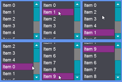
The `DragDropReorderMode` controls whether the user can automatically reorder `ListBoxItems` by pushing on an item and dragging it to a new location. By default this value is set to `NoReorder`, but it can be changed to enable reordering.
The following code creates a ListBox which supports reordering:
```csharp
// Initialize
var listBox = new ListBox();
listBox.AddToRoot();
for(int i = 0; i < 10; i++)
{
listBox.Items.Add("Item " + i);
}
listBox.DragDropReorderMode = DragDropReorderMode.Immediate;
```
[Try on XnaFiddle.NET](https://xnafiddle.net/#snippet=H4sIAAAAAAAACm2MwQrCMAyG74O9Q-hpYzL06vSgDGSgl-Gxl0KjBNZGuk7FsXe3nXozlz_5knxjmgCIpj8MRqzBuwEXMyFLnlRHLwxY3JWDjnq_5ydsweIDjp8pyytpv5typ_WZW2Y_U2kv7DKyHij8LKsQG1jFLIpc2lFaCPX7bTyaPhoyKWIPUkABFEVTdP3uaqeuteNbi-w0uhNrDPY_tGyMQU3KYyXSZEqTN_BbeGDqAAAA)
ListBoxItems reordering
## Decorations and Separators
A *decoration* is an inert visual — a separator line, a group header, or other chrome — that renders between rows but is not part of the list's data. A decoration lives in the ListBox's `InnerPanel.Children` alongside the row visuals, so it appears inline between items, but it belongs to **neither `Items` nor `ListBoxItems`**. As a result:
* `SelectedIndex` and `SelectedObject` stay contiguous. The row after a decoration keeps its data index, so adding a decoration never shifts your indices.
* A decoration can never be selected, clicked to select, or reached by keyboard or gamepad navigation. Clicking it does nothing, and arrow or d-pad navigation skips over it.
### Adding a Separator Between Groups
A thin, filled horizontal line makes a natural separator. Build one from any inert visual — a `RectangleRuntime` works well — and anchor it to a data item with `InsertDecorationAfter` (or `InsertDecorationBefore`):
```csharp
// Initialize
var listBox = new ListBox();
listBox.AddToRoot();
listBox.X = 50;
listBox.Y = 50;
listBox.Width = 400;
listBox.Height = 300;
// First group
listBox.Items.Add("Resume");
listBox.Items.Add("Options");
// Second group
listBox.Items.Add("Quit to Menu");
listBox.Items.Add("Quit to Desktop");
// Drop a separator between the two groups, anchored to the last item of the first group.
var separator = new RectangleRuntime();
separator.Height = 2;
separator.Width = 0;
separator.WidthUnits = DimensionUnitType.RelativeToParent;
listBox.InsertDecorationAfter("Options", separator);
```
### Anchoring and Lifetime
A decoration is **anchored to a data item**, not to a fixed position:
* It follows its anchor item when the list is reordered — including the drag-and-drop reordering described in **Reordering With Drag+Drop** above.
* It is automatically removed when its anchor item is removed from `Items`.
The three add methods differ only in how the anchor is chosen:
| Method | Anchor |
| -------------------------------------- | ---------------------------------------------------------------------------------------------------------------------------------------------------------------------------------------------- |
| `AddDecoration(visual)` | The item that is **currently last** in `Items` (the "add now" case). Items added afterward appear below the decoration. If `Items` is empty, the decoration is placed at the end of the panel. |
| `InsertDecorationAfter(item, visual)` | Immediately **after** the given item's row. |
| `InsertDecorationBefore(item, visual)` | Immediately **before** the given item's row. |
`InsertDecorationAfter` and `InsertDecorationBefore` throw an `ArgumentException` if the anchor item is not in `Items`. Call `RemoveDecoration(visual)` to take a decoration out manually; it returns `true` if the visual was a tracked decoration. Re-adding a decoration that is already tracked re-anchors it rather than adding it twice.
{% hint style="info" %}
Because decorations stay out of `Items`, binding a ListBox to a typed `ObservableCollection` remains valid with decorations present — the bound collection only ever contains your data objects. See [Items Binding (ListBox, ComboBox, ItemsControl)](/gum/code/binding-viewmodels/items-binding-listbox-combobox-itemscontrol.md).
{% endhint %}
{% hint style="info" %}
The decoration methods are defined on `ItemsControl` / `ListBox`, so they are available on every runtime. The visual you pass in is your own: any `GraphicalUiElement` works, so pick a type your platform provides (for example a `RectangleRuntime` on MonoGame/KNI/FNA/Raylib).
{% endhint %}
## Customizing with VisualTemplate
The VisualTemplate lets you customize the type of ListBoxItem created for the ListBox. The following code shows how to assign a VisualTemplate to a runtime object named CustomListBoxItemRuntime:
```csharp
// Initialize
// assign the template before adding new list items
listBox.VisualTemplate =
new Gum.Forms.VisualTemplate(() =>
// do not create a forms object because this template will be
// automatically added to a ListBoxItem by the ListBox:
new CustomListBoxItemRuntime(tryCreateFormsObject:false));
```
The VisualTemplate class can optionally pass a parameter representing the item in the list box. This can be used to create different types of items based on the object added. For example the following code would compare the passed object as an integer to whether it is greater than 100 and returns a different item depending on this result:
```csharp
// Initialize
// assign the template before adding new list items
listBox.VisualTemplate =
new Gum.Forms.VisualTemplate((item) =>
{
// Be sure you know the type before casting:
var itemAsInt = (int)item;
if(itemAsInt > 100)
{
return new CustomListBoxItemHighValue(tryCreateFormsObject:false);
}
else
{
return new CustomListBoxItemLowValue(tryCreateFormsObject:false);
}
}
```
{% hint style="info" %}
Note that the code above uses the item to decide which type of list box item to create. If your list box item needs to react to changes on the item, you can also pass the item in the constructor to your list box. This allows for additional initialization based on the item. You can also hold on to the reference of the item to react to changes that may happen on the item, or to push changes to the item.
In other words, you are free to use the item for your game's needs; however, keep in mind that UpdateToObject will be called after your ListBoxItem is constructed. For more information on how to customize UpdateToObject, see the section below.
{% endhint %}
## Customizing Displayed Property with ListBoxItemFormsType
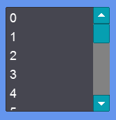
By default the `ListBox` calls `ToString` on each item. This is usually okay if you are dealing with primitive types. For example, the following code adds sequential integers to a ListBox:
```csharp
// Initialize
for (int i = 0; i < 20; i++)
{
listBox.Items.Add(i);
}
```
ListBox displaying integers
Often you may want to add a list of items which should not use their ToString method. For example you may have a list of IDs which represent weapons in a dictionary. The display can be customized by inheriting from `ListBoxItem` as shown in the following code:
```csharp
// Initialize
listBox.ListBoxItemFormsType = typeof(WeaponDisplayingListBoxItem);
foreach(var weapon in weapons)
{
listBox.Items.Add(weapon.Id);
}
// define WeaponDisplayingListBoxItem
class WeaponDisplayingListBoxItem : ListBoxItem
{
public WeaponDisplayingListBoxItem(InteractiveGue gue) : base(gue) { }
public override void UpdateToObject(object o)
{
var idAsInt = (int)o;
// assuming this has access to Weapons:
var weapon = Weapons[idAsInt];
coreText.RawText = weapon.Name;
}
}
```
## Sizing to Children
`ListBoxes` can be sized to their children. If using code-only, then the `ListBoxVisual` can be obtained by casting to call `MakeHeightSizedToChildren`.
```csharp
StackPanel stackPanel = new();
stackPanel.AddToRoot();
stackPanel.X = 100;
stackPanel.Y = 100;
var button = new Button();
stackPanel.AddChild(button);
button.Text = "Add Item";
ListBox listBox = new();
stackPanel.AddChild(listBox);
((Gum.Forms.DefaultVisuals.V3.ListBoxVisual)listBox.Visual).MakeHeightSizedToChildren();
button.Click += (_,_) => listBox.Items.Add("Item " + listBox.Items.Count);
```
[Try on XnaFiddle.NET](https://xnafiddle.net/#snippet=H4sIAAAAAAAAA3VQXUsDMRD8KyFPOTjC2b5duQd7fhUUxJaqWCmxt23D5RK4bLQo_neTJlos-pTM7Owwsx90Yi9dR0vsHeTUWak3lpZP1JP8Xvaw7kUH9DmnUkuUQsl3oCWdoli1t0KDIvbwrYiGN5aNFvpA8tOmmZk7Y_B48OD1J0Xxm3z8IV9FT14cotHRl4z34A_7eitVw6I2TOOPz2CHfnXhimIw8DIyQegi8qJraXFsdkSl97_s0TypwpixcJoL03eWn8FaOIVzaZ1Qls-HPNlGJktrPEF-I1q4ArnZ4tTf0d9l795DbJVy10qu2hh7XBG2zJcZqQIcnn-n5aGKDfFYLBRwapo2j6S1cRqzEf38AstbplTxAQAA)
Sizes can also be limited by setting the maximum size of the ClipContainer:
---
# Agent Instructions
This documentation is published with GitBook. GitBook is the documentation platform designed so that both humans and AI agents can read, navigate, and reason over technical content effectively. Learn more at gitbook.com.
## Querying This Documentation
If you need additional information that is not directly available in this page, you can query the documentation by asking a question.
Perform an HTTP GET request on the following URL with the `ask` and `goal` query parameters:
```
GET https://docs.flatredball.com/gum/code/controls/listbox.md?ask=&goal=
```
`ask` is the immediate question: it should be specific, self-contained, and written in natural language.
`goal` is what the user is ultimately trying to achieve, the reason they need the answer. Sharing it helps GitBook give you a better, more relevant answer. A goal is most helpful when it describes the outcome the user wants rather than restating the question. For example, with `ask=how do I create an API token`, a goal like `automate deployments from our CI pipeline` lets GitBook tailor the answer to that use case.
The response will contain a direct answer to the question and relevant excerpts and sources from the documentation.
Use this mechanism when the answer is not explicitly present in the current page, you need clarification or additional context, or you want to retrieve related documentation sections.