For the complete documentation index, see llms.txt. This page is also available as Markdown.

TextBox

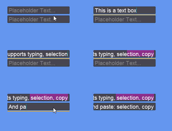
The TextBox control allows users to enter a string. It supports highlighting, copy/paste, selection with mouse and keyboard, and CTRL key for performing operations on entire words.

Code Example: Creating a TextBox

The following code creates two TextBoxes.

// Initialize
var panel = new StackPanel();
panel.Spacing = 5;
panel.X = 50;
panel.Y = 50;
panel.AddToRoot();

var textBox = new TextBox();
textBox.Width = 200;
textBox.Placeholder = "Placeholder Text...";
panel.AddChild(textBox);

var textBox2 = new TextBox();
textBox2.Width = 200;
textBox2.Placeholder = "Placeholder Text...";
panel.AddChild(textBox2);

Try on XnaFiddle.NET

Interacting with TextBoxes

Typing

TextBox supports reading characters from the keyboard. It supports:

  • Regular character typing - inserts a character the the caret position (CaretIndex)

  • Backspace - removes a character at the index before the caret

  • Delete - removes a character at the caret index

  • Enter (if multi-line) - inserts the newline character ('\n')

  • Keyboard repeat rate - if a key is held, the repeat rate applies according to the OS settings

  • CTRL X, C, and V for cut, copy, and paste

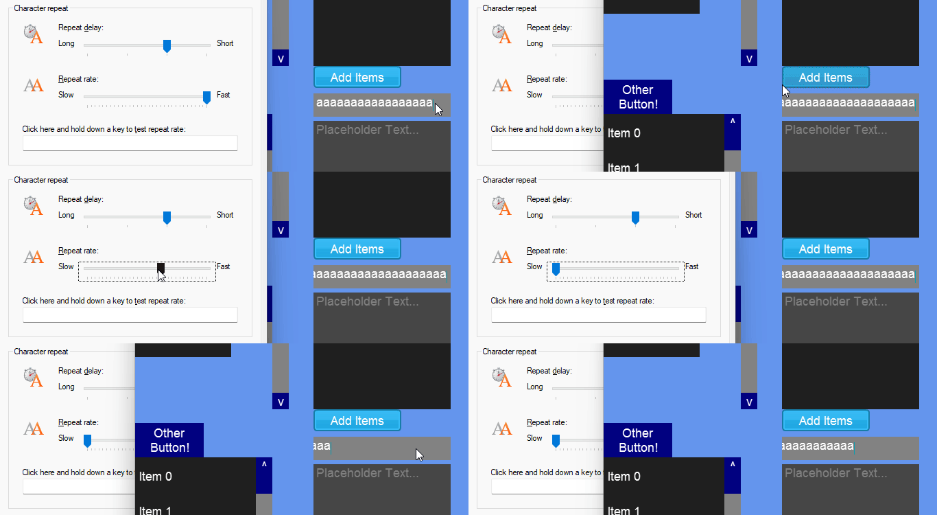
The TextBox respects the OS-level repat rate. For example, the following animation shows the TextBox responding to the Windows Key repeat rate.

Key repeat rate adjusted in Windows

PreviewTextInput

The PreviewTextInput event is raised in response to user input that adds text — specifically, regular typing and pasting. It fires before the text is applied, so it can be used to react to (and optionally reject) text before it is added to the TextBox.

PreviewTextInput is intentionally narrow in scope:

  • It is raised only by user input (typing and pasting). It is not raised when the Text property is set in code.

  • It is not raised by deletion — backspace, delete, and cut do not raise it, because nothing is being added.

  • It is a pre-change, cancelable preview, not an after-the-fact notification. To respond to every change to the text regardless of source, use the TextChanged event instead.

The event includes arguments with a Handled property. Setting this to true prevents the Text from being added to the TextBox. The argument's Text property contains the newly-added text. Keep in mind this can be a longer string if the user has pasted text, so you may need to check all letters rather than only the first.

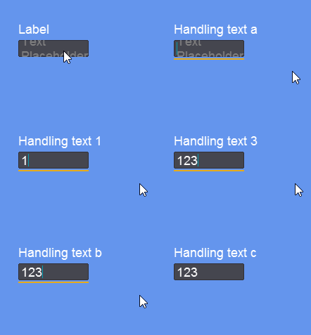
For example, the following code shows how to only allow numbers in a TextBox:

Try on XnaFiddle.NEt

TextBox only allowing numbers

IsReadOnly

If IsReadOnly is set to true, then the user cannot modify a TextBox's Text. Setting IsReadOnly to true results in the following TextBox behavior:

  • Text cannot be changed by typing, pasting, cutting, or deleting text with the keyboard

  • Text can be selected with the mouse or with key combinations (shift + arrow key)

  • Text can be copied

  • The TextBox can receive focus

  • The Caret is optionally visible depending on whether IsCaretVisibleWhenReadOnly is set to true. By default IsCaretVisibleWhenReadOnly is false.

The following code shows how to create a read-only TextBox:

Try on XnaFiddle.NET

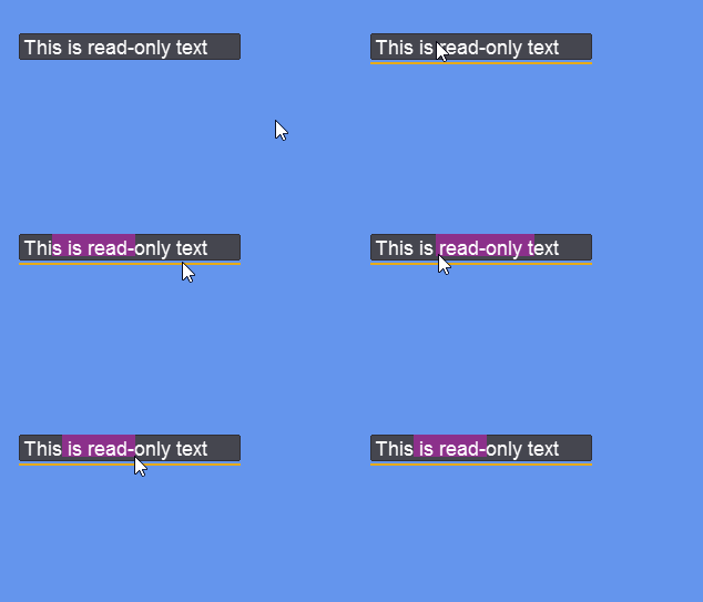
TextBox with IsReadOnly set to true responding to mouse click+drag and double-click

MaxLength

The MaxLength property can be used to restrict the number of characters that can be entered into a TextBox. This limit applies to both user typing and pasting. If a user attempts to type more characters than allowed, the extra characters are ignored. If a user pastes a string that would exceed the limit, the string is truncated to fit.

The following code creates a TextBox with a MaxLength of 10:

Try on XnaFiddle.NET

Selection

Selection can be performed programmatically or by the user using the cursor.

The SelectionLength property can be used to determine if any text is selected. The following code shows how to output the selected characters:

The SelectionStart and SelectionLength properties can be modified to change the visual selection. For example, the following selects the first 5 letters:

The entire text can be selected as shown in the following code:

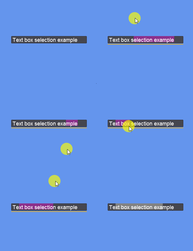
Selection can also be performed by the user. Double-clicking the text box selects all text. Also, pressing CTRL+A selects all text.

Double-click selects all text

A push+drag with the mouse selects the text between the start and the current location of the drag.

Push+drag to select text

Selection is performed based on the X position of the cursor, even if the cursor is outside of the bounds of the TextBox.

Selection by dragging outside of the TextBox bounds

Holding down the shift key and pressing the arrow keys adjusts the selection. CTRL+Shift+arrow selects the next or previous word.

Arrow keys + shift to select

CaretIndex

CaretIndex returns the index of the caret where 0 is before the first letter. This value is updated automatically when letters are typed, the caret is moved with arrow/home/end, and when the cursor is clicked and the cursor is moved.

The user can modify the CaretIndex using the following actions:

  • Clicking in the text box places the caret at the nearest index to the click point

  • Typing text moves the caret to the right by one character

  • Pasting text moves the caret to the end of the pasted text

  • Left arrow and right arrow on the keyboard moves the caret to the left or right by one index

  • CTRL + left arrow and CTRL + right arrow move the caret to the left or right by one word

  • Home key moves the caret to the beginning of the line

  • End key moves the caret to the end of the line

CaretIndex can be explicitly set in code to move the caret position.

When CaretIndex changes the CaretIndexChanged event is raised.

The following code shows how to display the CaretIndex in a label:

Try on XnaFiddle.NET

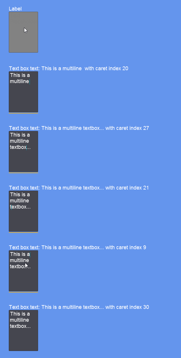
CaretIndexChanged is invoked whenever the caret index changes, which updates the Label's text.

Placeholder

The Placeholder property sets the placeholder text which appears when there is no text in the TextBox.

The placeholder text automatically disappears when the user has entered text.

The following code shows how to set Placeholder :

Try on XnaFiddle.Net

Placeholder can be removed by assigning an empty string:

TextWrapping

The TextWrapping property can be used to set whether the TextBox wraps text. By default this value is set to TextWrapping.NoWrap which means the text does not wrap, but instead extends horizontally.

Try on XnaFiddle.NET

TextWrapping.NoWrap causes text to scroll

If TextWrapping is set to TextWrapping.Wrap, then text wraps to multiple lines. Note that usually this is combined with a taller text box so that multiple lines display properly.

Try on XnaFiddle.NET

TextWrapping.Wrap causes text to wrap

Enter Key Behavior

The behavior of the Enter key depends on the AcceptsReturn property and whether the TextBox is bound to a data source.

Multi-Line Entry (AcceptsReturn)

AcceptsReturn can be set to true to add newlines when the return (enter) key is pressed.

Try on XnaFiddle.NET

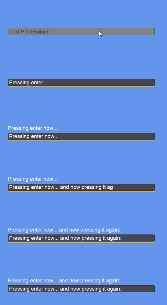
Manually adding newlines by pressing the return (enter) key
Enter and Binding

The TextBox.Text property can be bound to a ViewModel's property. By default this property is updated immediately when text changes but the UpdateSourceTrigger can be set to UpdateSourceTrigger.LostFocus.

In this situation, the enter key also applies binding even if the TextBox has not lost focus.

Pressing enter applies binding

Binding to Numeric Properties

TextBox.Text can be bound to any standard numeric ViewModel property — byte, int, float, double, or decimal. The binding automatically converts between strings and numbers, so no Converter is required for these types.

The following ViewModel exposes an int:

The TextBox can be bound directly to Score:

When the user types valid numeric input, the bound property is updated. When the input cannot be parsed — for example, letters in a field bound to int — the binding silently leaves the source unchanged. No exception is thrown.

For the system-level rule that drives this behavior, including how it works for any binding (not just TextBox), see Implicit Type Conversion.

Tab Key Behavior

The tab key behavior is controlled by the AcceptsTab property. This value is false by default.

If this value is false, pressing the Tab key does not insert a tab '\t' character.

If this value is true, pressing the Tab key inserts a tab '\t' character. Note that if this value is true, then tabbing to the next control by pressing tab is disabled. In other words, the TextBox keeps focus after the tab key is pressed. For more information on how focus navigation works, see the Tabbing (Moving Focus) page.

Extended Character Sets and Keyboards

The TextBox supports entering characters respecting the current keyboard language settings. This includes typing characters with accents, pasting text, and entering alt codes (https://www.alt-codes.net/ ).

TextBox displaying the é character

Characters must be available in the current font to support being written in TextBoxes. If you would like to support more characters, you can explicitly create a font (.fnt) including the desired characters, or change the default character set in Gum.

For more information on creating fonts, see the Font and Use Custom Font pages. For more information on specifying the default character set in Gum, see the Project Property Font Ranges page.

Last updated

Was this helpful?