> For the complete documentation index, see [llms.txt](https://docs.flatredball.com/gum/llms.txt). Markdown versions of documentation pages are available by appending `.md` to page URLs; this page is available as [Markdown](https://docs.flatredball.com/gum/code/styling/themes.md).

# Themes

A single line of code restyles **every** Gum Forms control. Drop in a built-in theme — or author your own — and the same UI takes on a completely different look without changing any of your control code.

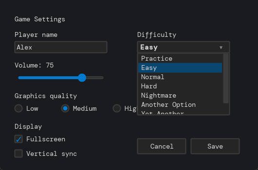
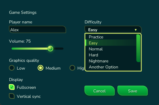
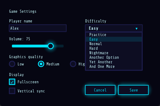
|                                      DarkPro                                     |                                      Bubblegum                                     |                                      Neon                                     |
| :------------------------------------------------------------------------------: | :--------------------------------------------------------------------------------: | :---------------------------------------------------------------------------: |
| <img src="/files/6l19tYft3fAocN0rWkOI" alt="DarkPro theme" data-size="original"> | <img src="/files/u2WxI5lFNwKwLr57NsE2" alt="Bubblegum theme" data-size="original"> | <img src="/files/bKb0PuN499agQGdcDyuk" alt="Neon theme" data-size="original"> |

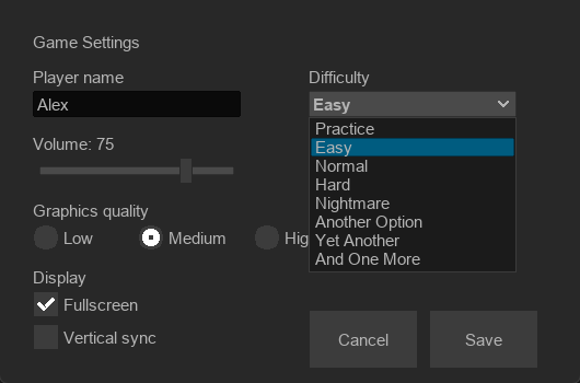
|                                     Retro 95                                     |                                      Forest Glade                                     |                                      Editor                                     |
| :------------------------------------------------------------------------------: | :-----------------------------------------------------------------------------------: | :-----------------------------------------------------------------------------: |
| <img src="/files/pGQcL3v58Hiw95ieAI1t" alt="Retro95 theme" data-size="original"> | <img src="/files/TUT6SrKW5r6RuajVpire" alt="Forest Glade theme" data-size="original"> | <img src="/files/Jc9NNbsIeKzBcP6Mp5g0" alt="Editor theme" data-size="original"> |

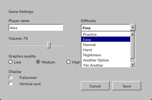
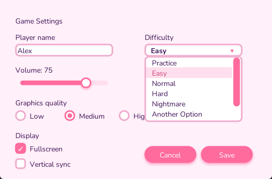
Here are six of Gum's built-in themes, each rendering the same sample settings panel. See [Available themes](#available-themes) below for the full catalog, with usage for each.

## Introduction

A **theme** is a per-backend NuGet package that restyles every default Gum Forms control with a single call. After calling `GumService.Default.Initialize(...)`, calling `<Name>Theme.Apply` swaps the default visuals for the theme's visuals — every `Button`, `TextBox`, `CheckBox`, `ComboBox`, etc. created afterward renders in that theme's style.

Themes ship one NuGet per rendering backend (for example `Gum.Themes.DarkPro.MonoGame`, `Gum.Themes.DarkPro.Kni`, and `Gum.Themes.DarkPro.Raylib`) so each package only carries the assets and references it needs.

{% hint style="warning" %}
All themes install and initialize KernSmith for dynamic font generation. Also, all themes except `Editor` install and initialize Apos.Shapes for vector art rendering on MonoGame/KNI. For more information see the [KernSmith](/gum/code/files-and-fonts/fonts/font-strategies.md#dynamic-kernsmith-generation) and [Apos.Shapes](/gum/code/standard-visuals/shapes-apos.shapes.md) pages.
{% endhint %}

## Usage

Install the package matching your runtime, then call the theme's `Apply` after `Initialize`:

```csharp
using Gum.Themes.DarkPro;

protected override void Initialize()
{
    GumService.Default.Initialize(this, DefaultVisualsVersion.Newest);

    DarkProTheme.Apply();

    var button = new Button();
    button.Text = "Click Me";
}
```

The pattern is the same for every theme — only the `using` namespace, NuGet package, and `Apply` call change. Pick a theme from the sections below, then copy the tab matching your rendering backend for a ready-to-paste install command and initialization snippet.

A few things to keep in mind:

* **Apply one theme per app.** `Apply` mutates the default visuals — calling more than one theme's `Apply` in the same process produces a mix of leftover state.
* **Call `Apply` after `Initialize` and before constructing Forms controls.** Controls capture their visuals at construction time, so any control built before `Apply` will keep the default styling.
* **Themes compose with per-control styling.** For tweaking a single control on top of a theme, see [Code-Only Styling](/gum/code/styling/code-only-styling/styling-using-activestyles.md) and [Control Customization in Gum Tool](/gum/code/styling/control-customization-in-gum-tool.md).

### Customizing a theme's colors and fonts

Every theme exposes a mutable `XyzStyling.ActiveStyle` object — its own analog of V3's [`Styling.ActiveStyle`](/gum/code/styling/code-only-styling/styling-using-activestyles.md), and mutated the same way: set properties on `Colors`/`Text` *before* calling the theme's `Apply()`, not after. Controls created after `Apply()` pick up the change; this is the same "mutate before construct" creation-order rule that page documents for V3's own styling.

```csharp
// Initialize
using Gum.Themes.DarkPro;

DarkProStyling.ActiveStyle.Colors.Accent = Color.Purple;

DarkProTheme.Apply();
```

Every theme's `Colors` exposes the same four guardrail properties — `TextPrimary`, `TextMuted`, `Primary`, and `Accent` — which also flow into V3's own `Styling.ActiveStyle.Colors` for any stock, un-restyled control the theme leaves in place. On some themes these are the theme's real, settable color names directly. On others — where the theme already had its own color vocabulary before the guardrail existed — they're get-only aliases onto a differently named real property; for example Forest Glade's `Colors.Accent` is a read-only alias for `Colors.LeafBright`. Assign the theme's real property in that case; the guardrail alias reflects the change automatically, the same "reactivity is free" behavior as any other derived color. The "How to customize" example under each theme below names the real, settable property to use.

`Text.FontFamily` selects among **already-registered** font families — it doesn't register a new one. Each theme registers its bundled TTFs once, inside `Apply()` / `RegisterBundledFonts()`, under a fixed family name exposed as a `BundledFontFamily` constant (e.g. `DarkProTheme.BundledFontFamily`). Reassigning `Text.FontFamily` only works if the family you name is already registered this way — either one of the theme's own bundled constants, or a font already installed on the host system, such as `"Consolas"` on Windows. KernSmith can resolve an installed system font by name without any explicit registration step, the same as the `Consolas` example on the [Styling Using ActiveStyles](/gum/code/styling/code-only-styling/styling-using-activestyles.md) page.

## Available themes

### Bubblegum

<figure><img src="/files/u2WxI5lFNwKwLr57NsE2" alt="Bubblegum theme preview"><figcaption><p>The Bubblegum theme applied to a sample settings panel.</p></figcaption></figure>

Pastel pink casual-game look with rounded pill buttons and soft drop shadows. Bundled font: Nunito.

{% tabs %}
{% tab title="MonoGame" %}

```bash
dotnet add package Gum.Themes.Bubblegum.MonoGame
```

```csharp
// Initialize
using Gum.Themes.Bubblegum;

BubblegumTheme.Apply();
```

{% endtab %}

{% tab title="KNI" %}

```bash
dotnet add package Gum.Themes.Bubblegum.Kni
```

```csharp
// Initialize
using Gum.Themes.Bubblegum;

BubblegumTheme.Apply();
```

{% endtab %}

{% tab title="Raylib" %}

```bash
dotnet add package Gum.Themes.Bubblegum.Raylib --prerelease
```

```csharp
// Initialize
using Gum.Themes.Bubblegum;

BubblegumTheme.Apply();
```

{% endtab %}
{% endtabs %}

#### How to customize

```csharp
// Initialize
using Gum.Themes.Bubblegum;

// Surface1/Background/Border/Placeholder are what TextBox actually reads for its
// fill/border/placeholder — Accent/Text alone only move the caret and typed text.
BubblegumStyling.ActiveStyle.Colors.Accent = new Color(40, 190, 190);
BubblegumStyling.ActiveStyle.Colors.Text = new Color(20, 30, 60);
BubblegumStyling.ActiveStyle.Colors.Muted = new Color(110, 120, 150);
BubblegumStyling.ActiveStyle.Colors.Surface1 = new Color(235, 250, 250);
BubblegumStyling.ActiveStyle.Colors.Background = new Color(230, 250, 248);
BubblegumStyling.ActiveStyle.Colors.Border = new Color(120, 200, 200);
BubblegumStyling.ActiveStyle.Colors.Placeholder = new Color(140, 170, 180);
BubblegumStyling.ActiveStyle.Text.FontFamily = "Consolas";
BubblegumStyling.ActiveStyle.Text.FontSize = 18;

BubblegumTheme.Apply();
```

<figure><img src="/files/5cVgpX3iQMaEXma5BMRN" alt=""><figcaption></figcaption></figure>

### DarkPro

<figure><img src="/files/6l19tYft3fAocN0rWkOI" alt="DarkPro theme preview"><figcaption><p>The DarkPro theme applied to a sample settings panel.</p></figcaption></figure>

Modern code-editor dark theme with a VS Code / JetBrains feel. Bundled fonts: DM Mono (body) and DejaVu Sans Mono (icons).

{% tabs %}
{% tab title="MonoGame" %}

```bash
dotnet add package Gum.Themes.DarkPro.MonoGame
```

```csharp
// Initialize
using Gum.Themes.DarkPro;

DarkProTheme.Apply();
```

{% endtab %}

{% tab title="KNI" %}

```bash
dotnet add package Gum.Themes.DarkPro.Kni
```

```csharp
// Initialize
using Gum.Themes.DarkPro;

DarkProTheme.Apply();
```

{% endtab %}

{% tab title="Raylib" %}

```bash
dotnet add package Gum.Themes.DarkPro.Raylib --prerelease
```

```csharp
// Initialize
using Gum.Themes.DarkPro;

DarkProTheme.Apply();
```

{% endtab %}
{% endtabs %}

#### How to customize

```csharp
// Initialize
using Gum.Themes.DarkPro;

DarkProStyling.ActiveStyle.Colors.Accent = new Color(214, 64, 214);
DarkProStyling.ActiveStyle.Colors.Text = new Color(245, 240, 235);
DarkProStyling.ActiveStyle.Colors.Muted = new Color(150, 140, 135);
// A serif reads as an obviously different font from the bundled DM Mono —
// a different monospace font would look "basically the same" at a glance.
DarkProStyling.ActiveStyle.Text.FontFamily = "Georgia";
DarkProStyling.ActiveStyle.Text.FontSize = 20;

DarkProTheme.Apply();
```

<figure><img src="/files/svn2VV3Fv1knFLKkSK3o" alt=""><figcaption></figcaption></figure>

### Editor

<figure><img src="/files/Jc9NNbsIeKzBcP6Mp5g0" alt="Editor theme preview"><figcaption><p>The Editor theme applied to a sample settings panel.</p></figcaption></figure>

Flat dark editor/tool chrome — intended for tool and editor interfaces rather than in-game UI. Ships with two extra controls beyond the standard Forms set: `PropertyGridVisual` and `Expander`. See the [Editor Theme](/gum/code/styling/themes/editor-theme.md) page for details on those controls.

{% tabs %}
{% tab title="MonoGame" %}

```bash
dotnet add package Gum.Themes.Editor.MonoGame
```

```csharp
// Initialize
using Gum.Themes.Editor;

EditorTheme.Apply();
```

{% endtab %}

{% tab title="KNI" %}

```bash
dotnet add package Gum.Themes.Editor.Kni
```

```csharp
// Initialize
using Gum.Themes.Editor;

EditorTheme.Apply();
```

{% endtab %}

{% tab title="Raylib" %}

```bash
dotnet add package Gum.Themes.Editor.Raylib --prerelease
```

```csharp
// Initialize
using Gum.Themes.Editor;

EditorTheme.Apply();
```

{% endtab %}
{% endtabs %}

#### How to customize

```csharp
// Initialize
using Gum.Themes.Editor;

EditorStyling.ActiveStyle.Colors.Accent = new Color(140, 190, 255);
EditorStyling.ActiveStyle.Colors.TextPrimary = new Color(210, 220, 255);
EditorStyling.ActiveStyle.Colors.TextMuted = new Color(100, 110, 140);
EditorStyling.ActiveStyle.Colors.Primary = new Color(50, 60, 90);
EditorStyling.ActiveStyle.Colors.BorderHover = new Color(120, 150, 210);
EditorStyling.ActiveStyle.Colors.BorderPushed = new Color(220, 230, 255);
EditorStyling.ActiveStyle.Colors.Selection = new Color(30, 80, 200);
EditorStyling.ActiveStyle.Colors.PanelBackground = new Color(18, 20, 32);
EditorStyling.ActiveStyle.Colors.RecessedBackground = new Color(8, 10, 20);
EditorStyling.ActiveStyle.Text.FontFamily = "Consolas";

EditorTheme.Apply();
```

<figure><img src="/files/phYU2nZTULCu6MKZGM7D" alt=""><figcaption></figcaption></figure>

### Forest Glade

<figure><img src="/files/TUT6SrKW5r6RuajVpire" alt="Forest Glade theme preview"><figcaption><p>The Forest Glade theme applied to a sample settings panel.</p></figcaption></figure>

Lush green nature-themed look with gradient leaf-shaped buttons (sharp top-left / bottom-right corners, rounded top-right / bottom-left), a deep canopy background, and soft text drop shadows. Bundled font: Nunito.

{% tabs %}
{% tab title="MonoGame" %}

```bash
dotnet add package Gum.Themes.ForestGlade.MonoGame
```

```csharp
// Initialize
using Gum.Themes.ForestGlade;

ForestGladeTheme.Apply();
```

{% endtab %}

{% tab title="KNI" %}

```bash
dotnet add package Gum.Themes.ForestGlade.Kni
```

```csharp
// Initialize
using Gum.Themes.ForestGlade;

ForestGladeTheme.Apply();
```

{% endtab %}

{% tab title="Raylib" %}

```bash
dotnet add package Gum.Themes.ForestGlade.Raylib --prerelease
```

```csharp
// Initialize
using Gum.Themes.ForestGlade;

ForestGladeTheme.Apply();
```

{% endtab %}
{% endtabs %}

{% hint style="info" %}
For the intended look, clear the back buffer to `ForestGladeStyling.ActiveStyle.Colors.CanopyDeep`.
{% endhint %}

#### How to customize

```csharp
// Initialize
using Gum.Themes.ForestGlade;

// ButtonVisual reads the Rest/Hover gradient-stop pairs and the glow/shadow tokens
// directly — LeafBright alone leaves the button fill, shadow, and hover glow on the
// old green palette, so gradients and glows matter more here than a font swap.
ForestGladeStyling.ActiveStyle.Colors.LeafBright = new Color(255, 105, 180);
ForestGladeStyling.ActiveStyle.Colors.Text = new Color(255, 240, 245);
ForestGladeStyling.ActiveStyle.Colors.Muted = new Color(200, 150, 165);
ForestGladeStyling.ActiveStyle.Colors.ButtonRestFillTop = new Color(255, 130, 190);
ForestGladeStyling.ActiveStyle.Colors.ButtonRestFillBottom = new Color(220, 60, 140);
ForestGladeStyling.ActiveStyle.Colors.ButtonHoverFillTop = new Color(255, 160, 210);
ForestGladeStyling.ActiveStyle.Colors.ButtonHoverFillBottom = new Color(255, 105, 180);
ForestGladeStyling.ActiveStyle.Colors.DarkShadow = new Color(60, 0, 40, 200);
ForestGladeStyling.ActiveStyle.Colors.GlowStrong = new Color(255, 105, 180, 170);
ForestGladeStyling.ActiveStyle.Colors.GlowMedium = new Color(255, 105, 180, 110);

ForestGladeTheme.Apply();
```

<figure><img src="/files/9NpOFoJ32GzlQAymh7nC" alt=""><figcaption></figcaption></figure>

### Hazard

<figure><img src="/files/fURVG1tcAZnuW5N7KIAE" alt=""><figcaption><p>The Hazard theme applied to a sample settings panel.</p></figcaption></figure>

Industrial space-salvage HUD inspired by Hardspace: Shipbreaker — signature hazard-yellow on warm near-black, muted-gold borders, and square-cornered chrome. Pressing a button flashes the full hazard-yellow accent with black text. Bundled fonts: Saira Condensed (body and labels) and DejaVu Sans Mono (icons).

{% tabs %}
{% tab title="MonoGame" %}

```bash
dotnet add package Gum.Themes.Hazard.MonoGame
```

```csharp
// Initialize
using Gum.Themes.Hazard;

HazardTheme.Apply();
```

{% endtab %}

{% tab title="KNI" %}

```bash
dotnet add package Gum.Themes.Hazard.Kni
```

```csharp
// Initialize
using Gum.Themes.Hazard;

HazardTheme.Apply();
```

{% endtab %}

{% tab title="Raylib" %}

```bash
dotnet add package Gum.Themes.Hazard.Raylib --prerelease
```

```csharp
// Initialize
using Gum.Themes.Hazard;

HazardTheme.Apply();
```

{% endtab %}
{% endtabs %}

{% hint style="info" %}
For the intended look, clear the back buffer to `HazardStyling.ActiveStyle.Colors.Background` (`#0A0A08`).
{% endhint %}

#### How to customize

```csharp
// Initialize
using Gum.Themes.Hazard;

// Selection (ListBox/MenuItem selected-row fill) and TextBright (its hover-row text)
// default to the same hazard-yellow as Accent, and AccentPressed (Slider thumb press)
// is a separate explicit token not derived from Accent — all three need to move with
// it. Border/BorderHover is the shared outline every restyled control uses (ListBox
// panel, Slider track, TextBox), so it has to move too or those three still read gold.
HazardStyling.ActiveStyle.Colors.Accent = new Color(40, 140, 255);
HazardStyling.ActiveStyle.Colors.Text = new Color(200, 230, 255);
HazardStyling.ActiveStyle.Colors.Muted = new Color(90, 110, 140);
HazardStyling.ActiveStyle.Colors.Selection = new Color(40, 140, 255);
HazardStyling.ActiveStyle.Colors.TextBright = new Color(150, 200, 255);
HazardStyling.ActiveStyle.Colors.AccentPressed = new Color(20, 100, 200);
HazardStyling.ActiveStyle.Colors.Border = new Color(30, 70, 130);
HazardStyling.ActiveStyle.Colors.BorderHover = new Color(70, 130, 200);
HazardStyling.ActiveStyle.Colors.Placeholder = new Color(100, 120, 150);
HazardStyling.ActiveStyle.Text.FontFamily = "Consolas";
HazardStyling.ActiveStyle.Text.FontSize = 17;

HazardTheme.Apply();
```

<figure><img src="/files/LRJEdt7zkbQF3YCqTQeU" alt=""><figcaption></figcaption></figure>

### Meadow

<figure><img src="/files/bS9L5ftDyegWrMrINtG4" alt=""><figcaption><p>The Meadow theme applied to a sample settings panel.</p></figcaption></figure>

Cozy cottagecore look with chunky sky-blue pill buttons (flat "stacked card" drop shadow), dashed-outline cream panels, sage selection accents, and coral sliders. Bundled fonts: Baloo 2 (display), Quicksand (body), and DejaVu Sans Mono (icons).

{% tabs %}
{% tab title="MonoGame" %}

```bash
dotnet add package Gum.Themes.Meadow.MonoGame
```

```csharp
// Initialize
using Gum.Themes.Meadow;

MeadowTheme.Apply();
```

{% endtab %}

{% tab title="KNI" %}

```bash
dotnet add package Gum.Themes.Meadow.Kni
```

```csharp
// Initialize
using Gum.Themes.Meadow;

MeadowTheme.Apply();
```

{% endtab %}

{% tab title="Raylib" %}

```bash
dotnet add package Gum.Themes.Meadow.Raylib --prerelease
```

```csharp
// Initialize
using Gum.Themes.Meadow;

MeadowTheme.Apply();
```

{% endtab %}
{% endtabs %}

{% hint style="info" %}
For the intended look, clear the back buffer to `MeadowStyling.ActiveStyle.Colors.Cream` (`#F7EDD6`).
{% endhint %}

#### How to customize

```csharp
// Initialize
using Gum.Themes.Meadow;

// Blue/BlueDark/BlueHover are the button's rest/pressed/hover fills — changing only
// Blue leaves the shadow and hover states on the old sky-blue gradient. SageDark is
// the checkbox/radio checked color; PeachDark is the shared border/outline token
// (ListBox, input fields, dashed panels, splitter).
MeadowStyling.ActiveStyle.Colors.Blue = new Color(230, 90, 70);
MeadowStyling.ActiveStyle.Colors.BlueDark = new Color(150, 45, 35);
MeadowStyling.ActiveStyle.Colors.BlueHover = new Color(245, 130, 105);
MeadowStyling.ActiveStyle.Colors.TealDark = new Color(90, 40, 80);
MeadowStyling.ActiveStyle.Colors.Muted = new Color(170, 130, 150);
MeadowStyling.ActiveStyle.Colors.SageDark = new Color(170, 90, 140);
MeadowStyling.ActiveStyle.Colors.PeachDark = new Color(200, 150, 175);
MeadowStyling.ActiveStyle.Colors.Cream = new Color(238, 222, 235);
MeadowStyling.ActiveStyle.Colors.Cream2 = new Color(245, 232, 242);
MeadowStyling.ActiveStyle.Text.FontFamily = "Consolas";
MeadowStyling.ActiveStyle.Text.FontSize = 17;

MeadowTheme.Apply();
```

<figure><img src="/files/eQhM0B59LLk5FQINShAq" alt=""><figcaption></figcaption></figure>

### Neon

<figure><img src="/files/bKb0PuN499agQGdcDyuk" alt="Neon theme preview"><figcaption><p>The Neon theme applied to a sample settings panel.</p></figcaption></figure>

Cyberpunk / neon-glow dark theme with a saturated cyan accent and a Gaussian glow on focus. Bundled fonts: Share Tech Mono (body), Orbitron (titles), and DejaVu Sans Mono (icons).

{% tabs %}
{% tab title="MonoGame" %}

```bash
dotnet add package Gum.Themes.Neon.MonoGame
```

```csharp
// Initialize
using Gum.Themes.Neon;

NeonTheme.Apply();
```

{% endtab %}

{% tab title="KNI" %}

```bash
dotnet add package Gum.Themes.Neon.Kni
```

```csharp
// Initialize
using Gum.Themes.Neon;

NeonTheme.Apply();
```

{% endtab %}

{% tab title="Raylib" %}

```bash
dotnet add package Gum.Themes.Neon.Raylib --prerelease
```

```csharp
// Initialize
using Gum.Themes.Neon;

NeonTheme.Apply();
```

{% endtab %}
{% endtabs %}

{% hint style="info" %}
For the intended look, clear the back buffer to `NeonStyling.ActiveStyle.Colors.Background` (`#060612`).
{% endhint %}

#### How to customize

```csharp
// Initialize
using Gum.Themes.Neon;

// Surface1 is what ListBoxVisual fills its background with, and Surface2 is its
// hover-row tint — both need to move together or a hovered row looks stale.
NeonStyling.ActiveStyle.Colors.Accent = new Color(255, 0, 200);
NeonStyling.ActiveStyle.Colors.Text = new Color(255, 250, 200);
NeonStyling.ActiveStyle.Colors.Muted = new Color(140, 110, 160);
NeonStyling.ActiveStyle.Colors.Surface1 = new Color(40, 10, 40);
NeonStyling.ActiveStyle.Colors.Surface2 = new Color(55, 15, 55);
NeonStyling.ActiveStyle.Text.FontFamily = "Consolas";
NeonStyling.ActiveStyle.Text.FontSize = 17;

NeonTheme.Apply();
```

<figure><img src="/files/65XftjLjRJbgD5adF4c8" alt=""><figcaption></figcaption></figure>

### Retro95

<figure><img src="/files/pGQcL3v58Hiw95ieAI1t" alt="Retro95 theme preview"><figcaption><p>The Retro95 theme applied to a sample settings panel.</p></figcaption></figure>

Windows 95 "Classic" battleship-gray chrome with raised/sunken bevels and navy selection. Bundled fonts: Nunito (MS Sans Serif stand-in) and DejaVu Sans Mono (icons).

{% tabs %}
{% tab title="MonoGame" %}

```bash
dotnet add package Gum.Themes.Retro95.MonoGame
```

```csharp
// Initialize
using Gum.Themes.Retro95;

Retro95Theme.Apply();
```

{% endtab %}

{% tab title="KNI" %}

```bash
dotnet add package Gum.Themes.Retro95.Kni
```

```csharp
// Initialize
using Gum.Themes.Retro95;

Retro95Theme.Apply();
```

{% endtab %}

{% tab title="Raylib" %}

```bash
dotnet add package Gum.Themes.Retro95.Raylib --prerelease
```

```csharp
// Initialize
using Gum.Themes.Retro95;

Retro95Theme.Apply();
```

{% endtab %}
{% endtabs %}

#### How to customize

```csharp
// Initialize
using Gum.Themes.Retro95;

// Surface also drives the app's own clear color if you follow the pattern from the
// Usage section above — Retro95 is the one theme where the outer backdrop is a real,
// settable token rather than a separate literal.
Retro95Styling.ActiveStyle.Colors.Surface = new Color(0, 128, 128);
Retro95Styling.ActiveStyle.Colors.WhiteFill = new Color(220, 255, 255);
Retro95Styling.ActiveStyle.Colors.Selection = new Color(128, 0, 32);
Retro95Styling.ActiveStyle.Colors.HighlightInner = new Color(150, 220, 220);
Retro95Styling.ActiveStyle.Colors.HighlightOuter = new Color(200, 255, 255);
Retro95Styling.ActiveStyle.Colors.ShadowInner = new Color(0, 80, 80);
Retro95Styling.ActiveStyle.Colors.ShadowOuter = new Color(0, 50, 50);
Retro95Styling.ActiveStyle.Colors.DisabledText = new Color(110, 70, 70);
Retro95Styling.ActiveStyle.Text.FontFamily = "Consolas";
Retro95Styling.ActiveStyle.Text.FontSize = 15;

Retro95Theme.Apply();
```

<figure><img src="/files/cD1ErH2tZJSMdyMnye88" alt=""><figcaption></figcaption></figure>

## Fonts and licensing

All bundled fonts are SIL Open Font License or the Bitstream Vera / DejaVu license — both permit redistribution. License files ship inside each NuGet.

## Supported backends

Themes are published for **MonoGame**, **KNI**, and **Raylib** (Raylib in preview — see the note under [Usage](#usage)). If you'd like to see a theme published for **FNA** or **Skia**, please open an issue or start a discussion on the [Gum GitHub repo](https://github.com/vchelaru/Gum).

## Requirements

* .NET 8.0+
* MonoGame 3.8+ (for the MonoGame packages), KNI (for the KNI packages), or Raylib (for the Raylib packages)
* [Gum.MonoGame](https://www.nuget.org/packages/Gum.MonoGame), [Gum.Kni](https://www.nuget.org/packages/Gum.Kni), or [Gum.raylib](https://www.nuget.org/packages/Gum.raylib)
* [KernSmith.MonoGameGum](https://www.nuget.org/packages/KernSmith.MonoGameGum) — optional, only needed when using runtime in-memory font generation


---

# Agent Instructions
This documentation is published with GitBook. GitBook is the documentation platform designed so that both humans and AI agents can read, navigate, and reason over technical content effectively. Learn more at gitbook.com.

## Querying This Documentation
If you need additional information that is not directly available in this page, you can query the documentation dynamically by asking a question.

Perform an HTTP GET request on the current page URL with the `ask` query parameter, and the optional `goal` query parameter:

```
GET https://docs.flatredball.com/gum/code/styling/themes.md?ask=<question>&goal=<endgoal>
```

`ask` is the immediate question: it should be specific, self-contained, and written in natural language.
`goal` is optional and describes the broader end goal you are ultimately trying to accomplish on behalf of the user. GitBook uses it to tailor the answer towards what is most useful for that goal.

The response will contain a direct answer to the question and relevant excerpts and sources from the documentation.

Use this mechanism when the answer is not explicitly present in the current page, you need clarification or additional context, or you want to retrieve related documentation sections.