LogoLogo
  • Gum Tool
    • Introduction
    • Setup
      • Running from Source
    • Showcase
    • Tutorials and Examples
      • Intro Tutorials
        • 1 - The Basics
        • 2 - Variables Tab
        • 3 - Files
        • 4 - Components
        • 5 - Exposing Variables
        • 6 - Parent
        • 7 - States
        • 8 - State Categories
      • Animation Tutorials
        • 1 - Introduction to Animation
        • 2 - Creating an Animation
        • 3 - Playing Animations inside other Animations
        • 4 - Combining Multiple Categories
      • Examples
        • Bottom-Up Stack
        • Centering
        • Custom NineSlice
        • Health Bar
        • Padding
    • Gum Elements
      • General Properties
        • Alpha
        • Base Type (Inheritance)
        • Blend
        • Clips Children
        • Has Events
        • Height Units
        • Ignored By Parent Size
        • Locked
        • Max Height
        • Max Width
        • Min Height
        • Min Width
        • Order
        • Parent
        • Rotation
        • Visible
        • Variable References
        • Width Units
        • X
        • X Origin
        • X Units
        • Y
        • Y Origin
        • Y Units
      • Behaviors
        • Default Implementation
      • Circle
      • ColoredRectangle
      • Component
        • Default Child Container
      • Container
        • Children Layout
        • Contained Type
        • Is Render Target
        • Stack Spacing
        • Wraps Children
      • NineSlice
        • Blend
        • Custom Frame Texture Coordinate Width
        • Texture Address
        • Texture Left
        • Texture Top
      • Polygon
        • Points
      • Skia Standard Elements
        • General Properties
          • Has Dropshadow
          • Is Filled
          • Use Gradient
        • Arc
          • Start Angle
          • Sweep Angle
          • Thickness
        • Canvas
        • ColoredCircle
        • LottieAnimation
        • RoundedRectangle
          • Corner Radius
        • Svg
      • Sprite
        • Color
        • Source File
        • Texture Address
        • Wrap
      • States
        • Categories
      • Text
        • Blue
        • Color
        • Font
        • Font Scale
        • Font Size
        • Green
        • Is Bold
        • Is Italic
        • MaxLettersToShow
        • Outline Thickness
        • Red
        • Text
        • Text Overflow Horizontal Mode
        • Text Overflow Vertical Mode
        • Use Custom Font
        • Use Font Smoothing
    • Project Tab
    • Code Tab
      • Runtime Generation Details
      • Generation Scope
      • Inheritance Location
      • Is CodeGen Plugin Enabled
      • Show CodeGen Preview
    • Localization
    • Menu
      • Content
      • Project Properties
    • Plugins
      • AddAndRemoveVariablesForType
      • AddMenuItem
      • Export
      • Setting Up Post Build Events
    • Variables
      • Add Variable
    • Bitmap font generator (.fnt)
    • Upgrading
      • Migrating 2025 April 27 to Preview
      • Breaking Changes
        • Removal of Variable Spaces
  • Code
    • Gum Code Reference
      • AnimationRuntime
      • BitmapCharacterInfo
      • BitmapFont
      • Camera
      • CircleRuntime
      • ColoredRectangleRuntime
      • Component Runtimes
      • ContainerRuntime
      • Cursor
      • Gum Class Overview
      • DataUiGrid
        • Reflection
        • Categories
      • ElementSave
        • ToGraphicalUiElement
      • GraphicalUiElement
        • Absolute Values
        • AddToManagers
        • AnimateSelf
        • ApplyState
        • BlendState
        • CanvasHeight
        • CanvasWidth
        • Children
        • ContainedElements
        • Font Values
        • GetAbsoluteHeight
        • GetAbsoluteWidth
        • GetChildByNameRecursively
        • GetFrameworkElementByName
        • IsAllLayoutSuspended
        • Parent
        • RemoveFromManagers
        • UpdateLayout
      • GumProjectSave
      • IDataUi
      • InstanceMember
      • InstanceSave
      • InteractiveGue
        • CurrentInputReceiver
        • RaiseChildrenEventsOutsideOfBounds
        • RollOverBubbling
      • IPositionedSizedObject
      • Layer
      • NineSliceRuntime
      • RectangleRuntime
      • Renderer
        • SinglePixelTexture
      • SelectedState
      • SpriteRenderer
        • LastFrameDrawStates
      • SpriteRuntime
        • TextureAddress
        • TextureHeight
        • TextureLeft
        • TextureTop
        • TextureWidth
      • TextRuntime
        • Color
        • FontScale
        • FontSize
        • HorizontalAlignment
        • Text Wrapping
        • VerticalAlignment
      • VariableSave
    • FNA
    • Kni
    • Meadow
    • MonoGame
      • Setup
        • Linking Game Project to Source (Optional)
      • Tutorials
        • Gum Project Forms Tutorial
          • Setup
          • Gum Screens
          • Common Component Types
          • Styling
          • Multiple Screens
        • Code-Only Gum Forms Tutorial
          • Setup
          • Forms Controls
          • ListBox Items
          • Input in Forms
        • [Deprecated] Gum Project (.gumx) Tutorial
          • Setup
          • Gum Screens
          • Gum Forms
          • Customizing Forms
          • Strongly Typed Components Using Code Generation
          • Multiple Screens
      • Setup for GumBatch (Optional)
      • Loading a Gum Project (Optional)
      • async Programming
      • Custom Runtimes
      • GumBatch
      • Gum Forms
        • Binding (ViewModels)
        • Controls
          • Button
          • CheckBox
          • FrameworkElement
            • BindingContext
            • IsEnabled
            • IsFocused
            • ModalRoot and PopupRoot
            • SetBinding
          • ListBox
          • ListBoxItem
          • MenuItem
          • PasswordBox
          • RadioButton
          • ScrollViewer
            • VerticalScrollBarValue
          • StackPanel
          • Slider
          • TextBox
        • Control Customization In Code
          • MenuItem
        • Control Customization in Gum Tool
        • Gamepad Support
        • Keyboard Support
        • Troubleshooting
      • File Loading
      • Resizing the Game Window
      • Known Issues
      • Samples
        • MonoGameGumFormsSample
    • Nez
    • Silk.NET
    • SkiaGum
      • Setup
        • WPF
    • .NET MAUI
      • Setup
Powered by GitBook
On this page
  • Introduction
  • Red1 and 2, Green1 and 2, Blue1 and 2
  • Gradient X1 and 2, Gradient Y1 and 2
  • Gradient X1 and X2 Units, Gradient Y1 and Y2 Units
  • Gradient Type

Was this helpful?

Edit on GitHub
Export as PDF
  1. Gum Tool
  2. Gum Elements
  3. Skia Standard Elements
  4. General Properties

Use Gradient

PreviousIs FilledNextArc

Last updated 4 months ago

Was this helpful?

Introduction

The Use Gradient property controls whether a Skia Standard Element uses gradient values if true or a solid color if false.

By default this value is false.

If this value is set to true, then additional properties appear for controlling the gradient.

Red1 and 2, Green1 and 2, Blue1 and 2

Gradients create a smooth interpolation of color from the first set of values (Red1, Green1, Blue1) to the second set of values (Red2, Green2, Blue2).

Changing these values adjusts the gradient start and end colors.

Gradient X1 and 2, Gradient Y1 and 2

The gradient values appear at their respective values at the points specified by Gradient X1, Gradient Y1, Gradient X2, and Gradient Y2. For example the gradient points could be visualized as shown in the following image:

Changing the Gradient X or Y values changes the start and end points for the gradient.

Gradient X1 and X2 Units, Gradient Y1 and Y2 Units

Gradient values use Units similar to X Units and Y Units. By default, gradient values are relative to the top-left of the element. Since the gradient values are not affected by size, changing the size of the element does not affect the gradient.

The gradient X and Y units can be changed. Each value can be set independently. For example, the X2 and Y2 units can be adjusted to be relative to the bottom-right corner of the instance. The following shows a RoundedRectangle with the Gradient X2 and Y2 values 100 pixels up and to the left of the bottom-right corner. If the RoundedRectangle is resized, then the gradient adjusts in response.

Gradient X and Y values can exist outside of the visual space of the instance, and even outside of its bounds. The following image shows an Arc with a gradient which is defined below the visual part of the arc. Notice that the Gradient Y values are both 0 PixelsFromBottom.

Gradient Type

Gradient Type controls whether the gradient is linear or radial. Radial gradients place the center of the radial gradient at X1,Y1 and the edge of the radial gradient at X2, Y2.

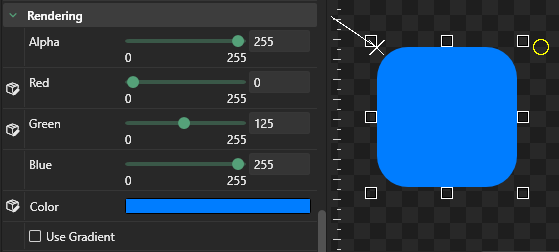
RoundedRectangle with Use Gradient set to false
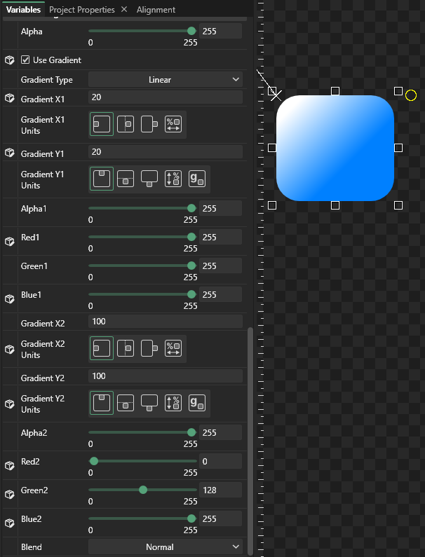
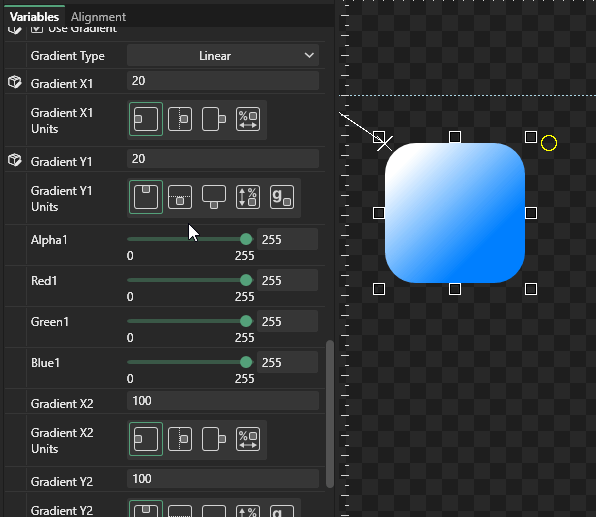
RoundedRectangle with Use Gradient set to true showing gradient values
Gradient Red, Green, and Blue values
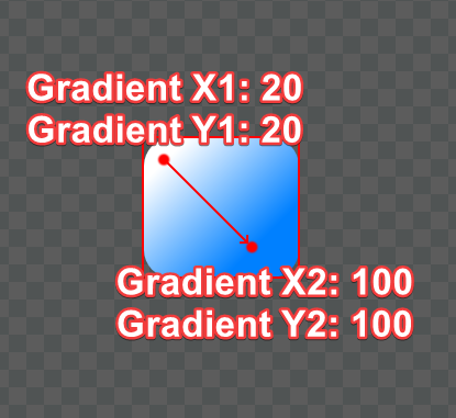
Gradient positions visualized over a RoundedRectangle
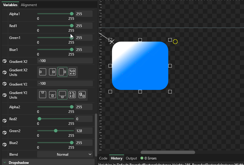
Changing gradient X and Y values changes the gradient direction and interpolation distance
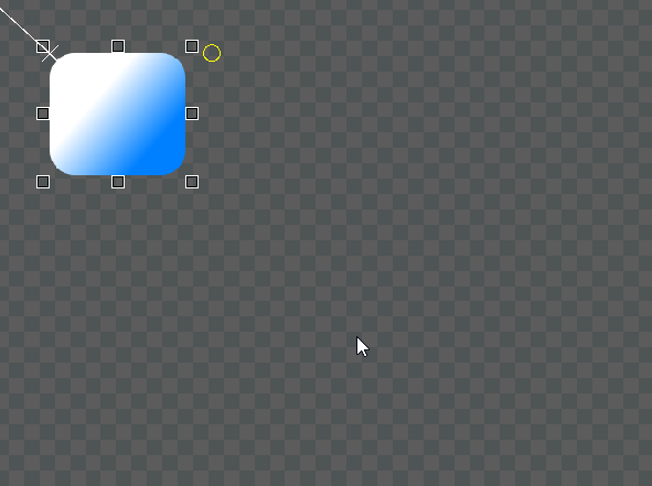
By default gradient values are relative to the element's top-left corner
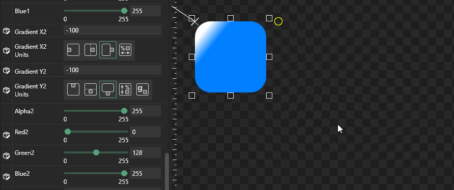
Gradient X and Y units relative to the bottom right of the instance.
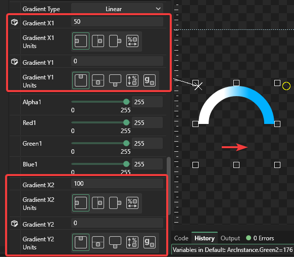
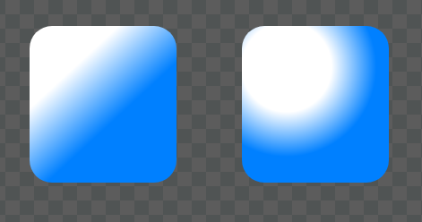
Linear Gradient Type on the left, Radial Gradient Type on the right